Readings: 6 Jun 2018
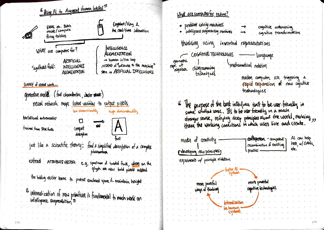
“Using Artificial Intelligence to Augment Human Intelligence” in Distill:
By being forced to find a compact description of the training examples, the neural net learns an abstract, higher-level model of what a font is. That higher-level model makes it possible to generalize beyond the training examples already seen, to produce realistic-looking fonts.
Shan Carter and Michael Nielsen describe a system where a neural network learns compact representation of the vectors along which attributes of font vary and has the capability to review new primitives to describe font design or to discover and make explicit new design principles. For example, the system identifies a “bolding” dimension, which captures the variation between weights of the same typeface. Rather than just naively thickening the lines, movement along the bolding vector preserves both line height and enclosed area1.
They see this as a specific example of how artificial intelligence can accelerate the exploration and discovery of novel representations for a system, which potentially can then get folded into human ways of thinking. Finding the right representation for a concept radically changes its usability — consider the fluency of arithmetic with Roman versus Arabic numerals.
Descartes discovered a means to represent geometric objects algebraically and created the potential for modern engineering as we know it. Imagine a neural network, set loose to find the latent variables that we overlook in systems, finding structure that a human can convert into a generalizable formal system.
The purpose of the best interfaces isn’t to be user-friendly in some shallow sense. It’s to be user-friendly in a much stronger sense, reifying deep principles about the world, making them the working conditions in which users live and create.
Outsourcing all labor to artificial intelligence is such a boring vision. I want human-AI hybridity.
-
I would be surprised if any font designer had to be told to maintain the same line height across variants, but I’m curious if “the enclosed area in a glyph should remain roughly constant across font weights” is a known design principle. ↩︎